Observa conducted our second annual study to measure the pricing of consumer goods supporting various lifestyles across the United States. The results revealed significant trends in how brands and retailers price their products in varying cities and how that correlates to the median income levels in the corresponding cities.
We learned that the price of most items increases with the size of the average paycheck, but at a much slower rate than the income. The income gap is leading to a gap in available lifestyle choices for consumers.
Overview
The Baskets
This study focused on a variety of lifestyles or stages in a person’s life. The Healthy Shopper Price Index included items like organic bananas and Justin’s almond butter; the Parenting Price Index included baby care items such as diapers and Avent bottles; the Golden Years Price Index included items like Ensure and playing cards; and the Fun Foods Price Index included items like Cheetos and Oreos.
Data Collection
During February and April of 2018, a nationwide network of observers collected the index data in real time across twenty-two US cities. This crowd of unbiased shoppers participated in multiple observations to collect the data, in which the average prices were then calculated and used for analysis.
The retailers observed remained consistent from city to city, with a few exceptions where this was not an option. For example, Whole Foods stores were used for all Healthy Food Index numbers, except for in two cities that did not have Whole Foods. Other comparable stores, like Natural Grocers, were surveyed instead. For the other three indexes, Target, Kroger, and Walmart stores were used.
If an item was on sale, that price was used.
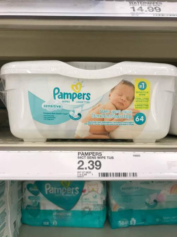
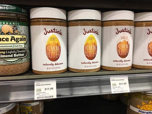
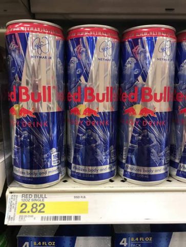
Figure 1: Images collected from Observers of index report items.
Overall Results
The results immediately showed that the basket costs increase as a city’s median income increases, but upon further analysis, these increases did not create an equitable difference in the relationship between the variables.
The cost of each basket compared to the median income of the corresponding city demonstrated how much of the median income is spent purchasing one basket every week for a year. It can be seen that the price increases (seen in Figure 2) do not create an equitable difference across the different cities (seen in Figure 3).
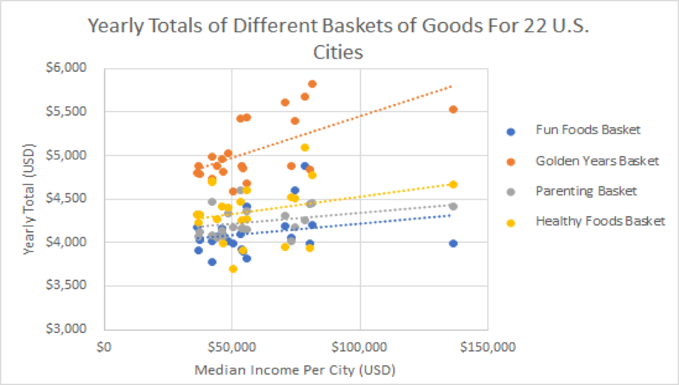
Figure 2: The graph demonstrates the correlation between the annual cost of each basket and the median income for the twenty-two US cities. There are twenty-two data points for each basket of goods, representing the twenty-two US cities surveyed.
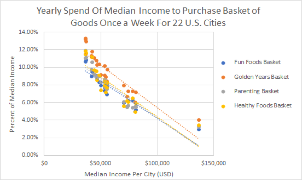
Figure 3: The graph shows the percentage of the median income it would take to purchase a basket and the cities’ median income. There are twenty-two data points for each basket of goods, representing the twenty-two US cities surveyed. It is important to note the slopes of the trendlines because these indicate the intensity of the disparity between cities.
Key Findings within the Baskets
Healthy Foods Pricing Index
- Healthy foods have the second greatest positive correlation for price and median income, so the cities with higher median incomes are paying more (by dollar amount) for these items.
- However, it is 3.5 times more expensive (by income spent) to eat healthy in Memphis than it is in Palo Alto. By dollar amount, Palo Alto is $300 more a year than Memphis.
- Chicken, almond butter, and milk are the items that vary most in price from city to city. Chicken and milk differences may be attributed to the different brands and suppliers that were available in each city.
- Larabars, bananas, and GTS Kombucha had the most consistent pricing in different cities.
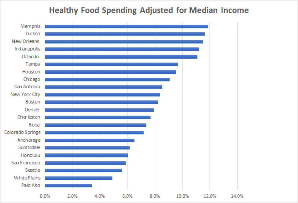
Figure 4: This graph demonstrates the percentage of median income required for each city to buy one basket of healthy foods every week for a year.

Figure 5: This chart shows all the pricing data collected for each city’s healthy food items. The colors are based on the 50th percentile (also known as median, middle value, or midpoint) of the column. The cell that holds the maximum value is red, while the cell that holds the minimum value is green. All other cells are colored proportionally to these.
Parenting Pricing Index
- On average, prices increase as the median income increases in each city.
- Prices of parenting supplies vary the least across the nation compared to healthy foods and golden years items. This results in an increase in the difference in income spending required to live that lifestyle across the nation.
- It is more than twice as expensive (by median income) to raise a child in Memphis than in Anchorage and three times more expensive than Palo Alto.
- Baby wipes, Pedialyte, and baby shampoo have the most consistent prices among items in this basket.
- Avent bottle prices vary the most of all items in this basket.
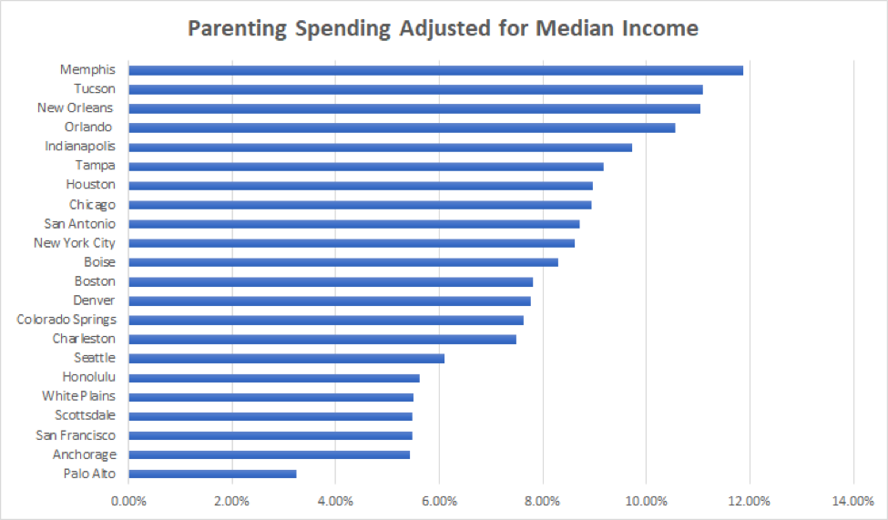
Figure 6: This graph demonstrates the percentage of median income required for each city to buy one basket of parenting items every week for a year.
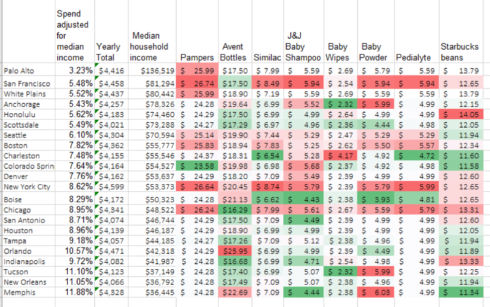 Figure 7: This chart shows all the pricing data collected for each city’s parenting items.
Golden Years Index
- The golden years basket has both the strongest (cities closely follow the slope) and largest (largest slope) correlation between the two variables.
- It is almost 3.5 times more expensive (by income spent) to purchase the golden years basket in New Orleans than it is in Palo Alto, but the price of the baskets varies only by less than $100.
- The Kellogg’s Raisin Bran cereal price varies the least of all the basket items.
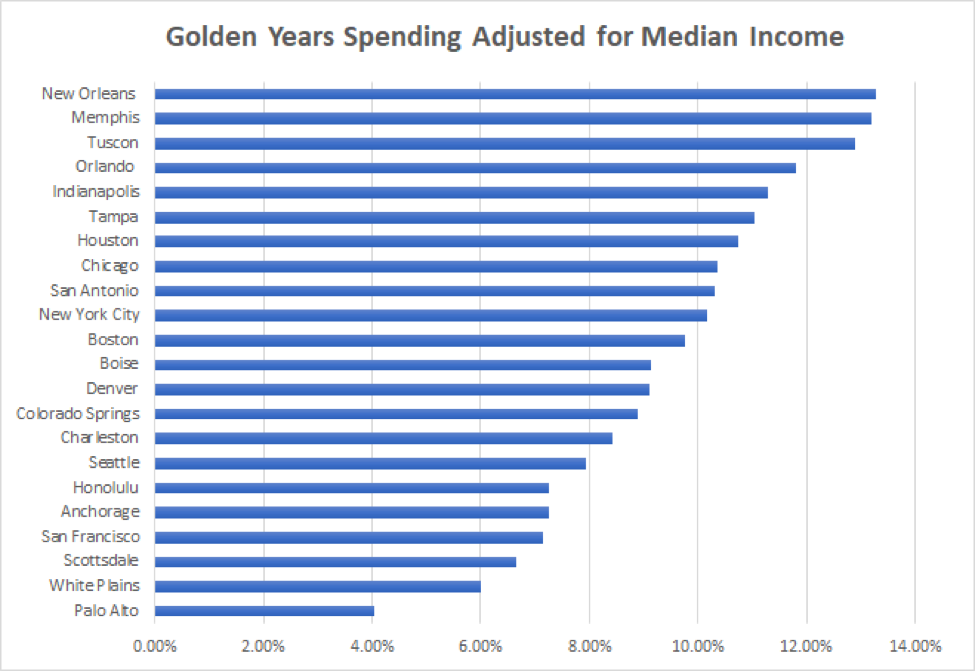
Figure 8: This graph demonstrates the percentage of median income required for each city to buy one basket of golden years items every week for a year.
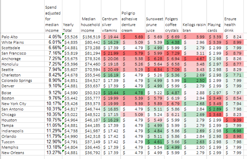 Figure 9: This chart shows all the pricing data collected for each city’s golden years items.
Fun Foods Index
- The cost of fun foods is more consistent across the nation than the other baskets but still increases slightly in cities with a higher median income.
- It is four times more expensive to eat fun foods in Memphis than in Palo Alto (by income spent), but the basket yearly total (by dollar amount) differs only by less than $200.
- Oreos and Snickers vary the least in their pricing across different cities.
- Bud Light varies the most in cost across the United States. The highest price is $21.99 in Anchorage.
- The positive correlation is the weakest for fun foods.
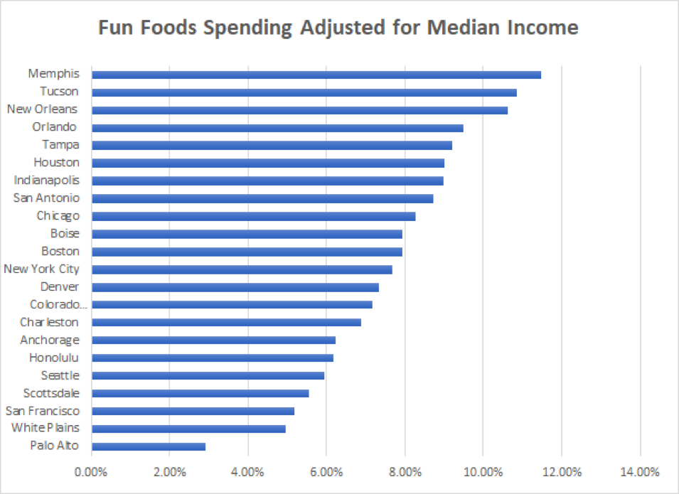
Figure 10: This graph demonstrates the percentage of median income required for each city to buy one basket of fun foods every week for a year.
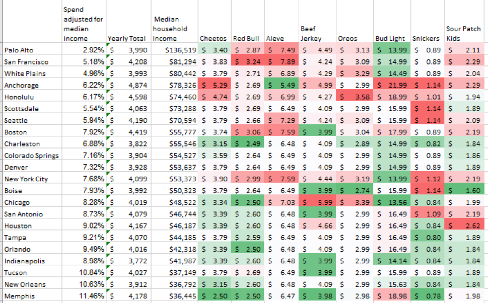 Figure 11: This chart shows all the pricing data collected for each city’s fun food items.
Recommendations
After reviewing this data, the question to ask is this: What more can be done? Prices are already typically a bit higher in high-income areas, and any further shift could harm sales in higher-income areas for those whose income is below the median. Remaining competitive with online prices is also a concern for both brands and retailers.
1. Local producer advantage
As mentioned in the 2017 Observa Index Report, large brands (like Oreo, Pedialyte, and Larabar) have consistent pricing compared to products that are frequently acquired from local production facilities (like chicken and milk). The transportation costs from the factories that produce large-brand products are increasing, therefore raising the costs of products.
The Observa Index Report reveals the price elasticity of these items frequently acquired from local producers, rather than production facilities on the other side of the country. By buying from local producers, the transportation costs decrease and brands or retailers have an opportunity to price their items lower.
This, of course, only works for certain products and cannot be applied to the large brand names as easily.
2. Partner programs and sacrifices
Financial pressure is currently falling on low-income consumers as they are forced to spend exorbitant amounts of their budgets to purchase healthy foods or parenting items.
However, there are many brands and retailers that are committed to making a positive impact. By making small sacrifices where possible, the results that trickle down to the consumer may be huge.
In the Observa Healthy Foods Index Report, Natural Grocers (a national retailer) was observed in a few cities that lacked a Whole Foods. In these observations, some items were discounted with special “Good4U” or “Health Hotline” price tags.
Upon further investigation, Observa discovered Natural Grocers negotiates deals with manufacturers of specific items. The savings from these deals are then passed down to the consumer in full as a commitment from the retailer. This is a combination of sacrifices from brands and retailers but encourages an encouraging looking to support equal access to healthy eating.
If multiple brands are willing to negotiate similar deals, as long as the commitment is also carried through from the retailer, there should be potential for programs like this to spread to larger retailers as well.
Conclusion
The Observa Index Report on different lifestyle costs across the United States confirms the disparities between US cities and the availability of goods to different consumers.
As median income increases, the cost of each basket tends to increase as well. However, these price increases do not level the playing field for all consumers to have the same access to products. Calculating the percentage of the yearly income that each city spent on the baskets studied reveals the economic imbalance. Consumers in low-income areas need to spend much more to live any of the lifestyles.
It is clear that consumers have limited purchasing power in many areas of the country, and the pressure falls on brands and retailers to change this. While the changes are not easy, they may result in a win–win for brands and consumers.
For additional fun information we collected from the Observa Index report, check out this post.