Observa conducted our second annual study to measure the pricing of consumer goods supporting different lifestyles across the United States. The results revealed significant trends on how brands and retailers price their products in various cities and how that correlates with the median income levels in those cities.
This study focused on a variety of lifestyles or stages in a person’s life. The Healthy Shopper Price Index included items like organic bananas and Justin’s almond butter; the Parenting Price Index included baby care items such as diapers and Avent bottles; the Golden Years Price Index included items like Ensure and playing cards; and the Fun Foods Price Index included items like Cheetos and Oreos.
If interested in the technical details, overall findings, and recommendations from the Observa Index Reports, check out this post. The following post discusses some of the more fun findings from the report.
Cheap Junk Food Makes You Unhealthy
To analyze how the cities compared to each other across all lifestyles, we looked at which lifestyles cost the most and least compared to the other three lifestyles in each corresponding city. Certain cities stood out as extremes, and when cross-checked with other recent studies, we found interesting connections.
Indianapolis
In Indianapolis, residents incur the highest costs in sustaining a healthy lifestyle as compared to the residents of other cities (Figure 2). Meanwhile, the city also pays the least to support the Fun Foods lifestyle (Figure 3).
It is considerably easier for residents of Indianapolis to eat foods from the Fun Foods index than it is to eat from the Healthy Foods index, more so than any other city surveyed. This may be a contributor to why they scored as the second unhealthiest city in America this year.
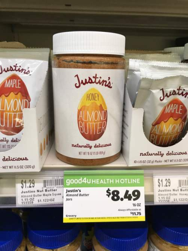
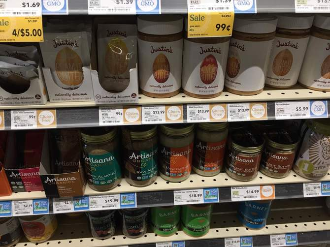
Figure 1: On the right is a photo an Observer captured of the $13.99 Justin’s Almond Butter in Indianapolis, while the left displays the same product for $8.49 in Boise.
Seattle and Boise
Seattle and Boise have the first and second lowest healthy food expenses compared to the other three lifestyles. Simply stated, it is cheaper to be healthy in these cities than to live the other lifestyles surveyed.
However, they both rank on the more expensive side for Fun Foods, as seen in the graph.
When comparing this to the same report that Indianapolis ranked extremely low on, Seattle and Boise both make the top ten healthiest cities list.
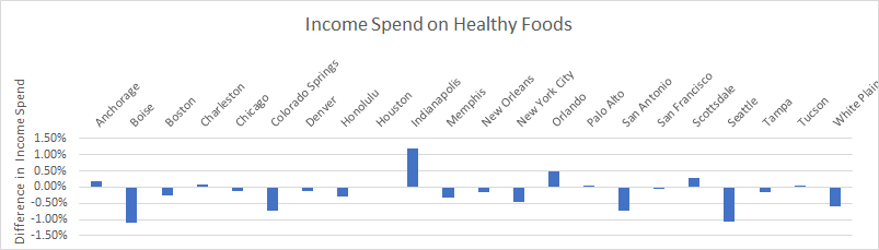
Figure 2: A graph depicting the expense difference between healthy eating and the average of the other three lifestyles. Bars going up represent cities that spend more on healthy eating than the other lifestyles, while bars going down represent the opposite.
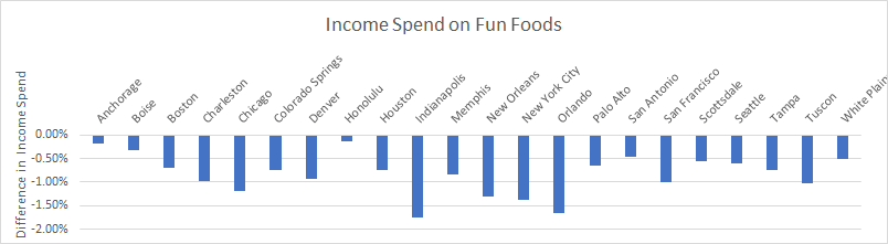
Figure 3: Similar to the chart above, this graph shows the spend difference between fun foods eating and the average of the other three lifestyles.
Babies in the Tundra!
Anchorage
Anchorage’s parenting expenses are significantly lower compared to the expenses required for the other three lifestyles. Also, this difference between the parenting lifestyle and the remaining three is the most significant difference as compared to the other twenty-one cities. Interestingly, Anchorage is the only city on our list that ranks among the top fifty U.S. city birth rates.
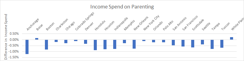
Figure 4: Similar to the previous charts, this graph shows the spend difference between the parenting lifestyle and the average of the other three lifestyles.
Items Causing the Disparities
A Chicken in Every Pot
Chicken is a staple item in many recipes and home cooking, commonly thought of as a healthier meat option. Observa’s report found that it varies in price across the nation, with a slight correlation with the median income.
In cities with lower median incomes, the price of an organic chicken breast was higher than in counterpart cities with higher incomes. There are, of course, outliers in the data with expensive price points in high-income cities such as Scottsdale and low price points in low-income cities such as New Orleans, but one can note an overall trend in the price-income correlation.
When taking into consideration the median income of households across the cities, the difference is massive. A family with a median income in a city like Palo Alto would only spend 0.28 percent of their yearly income on one pound of chicken breast a week, whereas a family with a median income in Memphis would need to spend 1.2 percent of their yearly income to eat the same food items.
Something to ponder is the fact the majority of chicken produced in the United States is produced in the South, around Memphis.
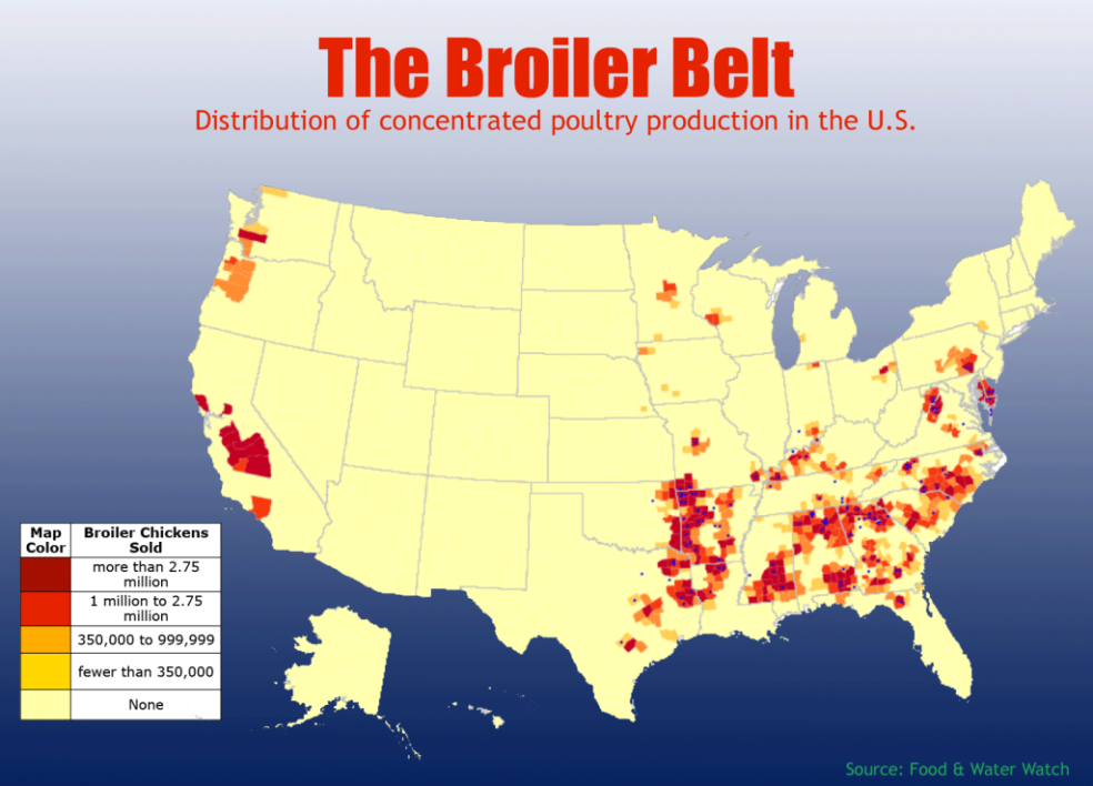
Figure 5: The location of chicken production in the United States.
This difference in price for a staple, healthy protein makes it difficult for consumers in low-income areas to eat healthier. Brands may see this as an opportunity to consider lowering prices in the lower-income areas and increasing prices in the high-income areas.
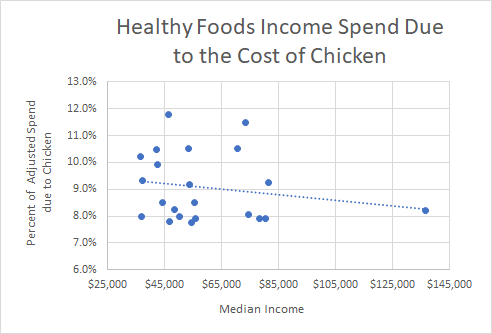
Figure 6: A graph demonstrating how much of the total basket-adjusted expenses go to chicken in one year.
Crying over Spilt Milk
Milk proves to have the opposite trend compared to chicken. In higher-income cities, a greater portion of the total spend required to eat healthy is due to the cost of milk. Lower-income cities, on the other hand, see a lower portion of their spend going toward buying milk.
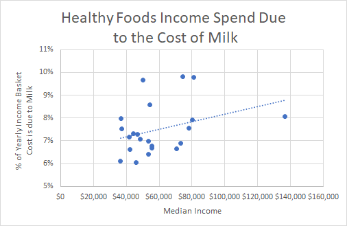
Figure 7: A graph demonstrating how much of the total basket-adjusted expenses go to milk in one year.
Amazon versus Brick and Mortar
Nowadays, most of the U.S. population uses Amazon to order goods straight to their doors. The deals seem great, but the convenience is better. A few clicks from the comfort of home saves that drive to the store, and it’s cheaper!
But wait, is Amazon cheaper?
Well, we decided to look and found that this may be a major misconception. Although there are items that are cheaper on Amazon, the majority of the items we looked at in-store are more expensive when ordered from Amazon. That also is not taking into account the shipping costs, potential return costs, or chance the item will arrive damaged.
We looked at the Amazon prices of the items in the Parenting and Golden Years baskets because these consisted of fewer perishable items.
The Parenting basket from Amazon had an annual cost of $5,216, which is around $1,000 more than the average of the 22 basket totals. Upon further inspection, Pampers diapers are $15 more on Amazon than in stores, typically. When removing this item from all yearly totals, the Amazon Parenting basket was still the fourth most expensive compared to all 22 cities.
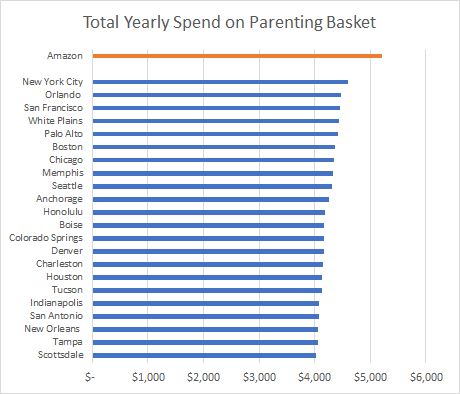
Figure 8: A graph depicting how much each city needs to spend to buy one Parenting basket of goods per week for an entire year. This is compared to the same items on Amazon, not including the price of shipping.
Items that stood out as more expensive on Amazon include Pampers, Avent bottles, baby wipes, and baby powder. On the other hand, coffee beans and baby shampoo were noticeably cheaper than the in-store prices.
The Amazon Golden Years basket ranked as the sixth most expensive basket compared to the 22 cities’ yearly totals. Items such as Poligrip denture cream, Sunsweet prune juice, and Ensure health drinks were significantly more expensive than their in-store counterparts. Meanwhile, items such as Centrum Silver vitamins and Folgers coffee crystals were less expensive.
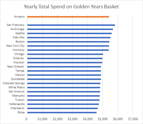
Figure 9: A graph depicting how much each city needs to spend to buy one Golden Years basket of goods per week for an entire year. This is compared to the same items on Amazon, not including the price of shipping.
It’s important to note that there are certain items that are cheaper on Amazon, but there are many items that are not. It is therefore a misconception that Amazon always has the best deals, and there is value in checking stores as well.